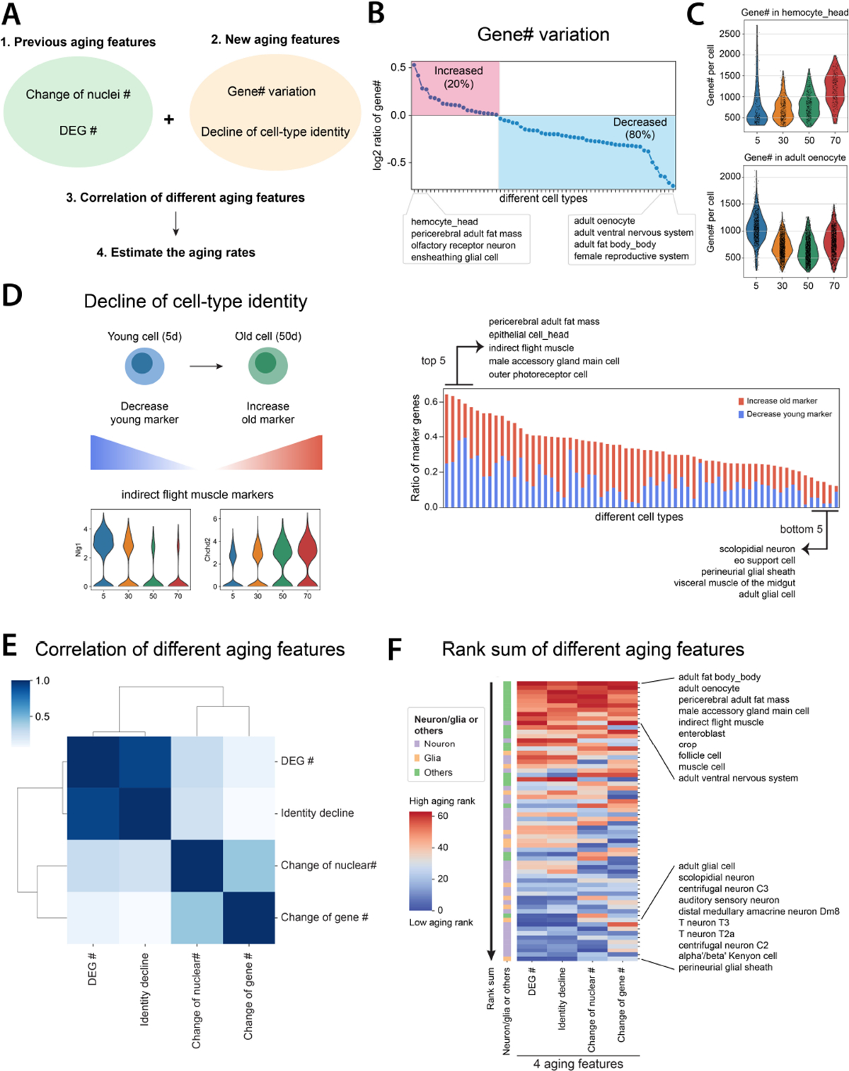
Figure 5. Systematic comparisons of different aging features.

A) Flowchart of comparing different aging features.
B) Expressed gene numbers per cell from each cell type are compared between 50d and 5d flies. The red block shows cell types with increased expressed gene numbers, while the blue block includes cell types with decreased ones.
C) Two cell types, hemocyte from the head and oenocyte, have the highest increase and decrease of expressed gene numbers per cell.
D) Decline of cell identity during aging. The left panel illustrates two different mechanisms of decreasing cell identity. The right panel shows the ratio of marker genes decreasing cell identity. Each line in the right panel represents one cell type.
E) Spearman’s correlation of different aging features.
F) Rank sums of different aging features. The heatmap shows the overall rank sum scores from different cell types. High aging ranks are shown in red, while low aging ranks are shown in blue. Neuron- or glia-related cell types are indicated beside the heatmap.
