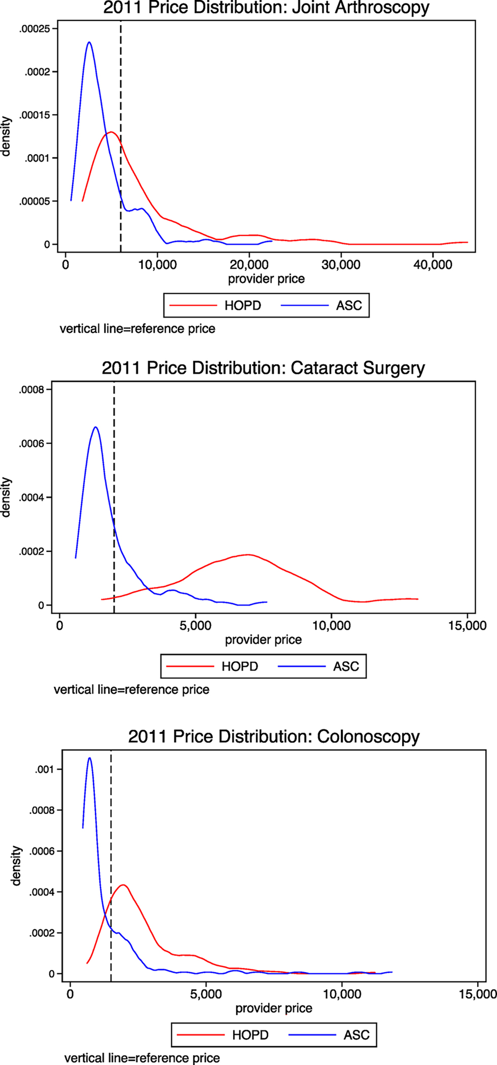
Fig. 1.

Distribution of provider prices. Each figure presents the distribution of each provider’s negotiated prices for the Anthem PPO in 2011. The blue line shows the distribution for services received at an ambulatory surgical center (ASC) and the red line shows prices for services received at an hospital outpatient department (HOPD).
