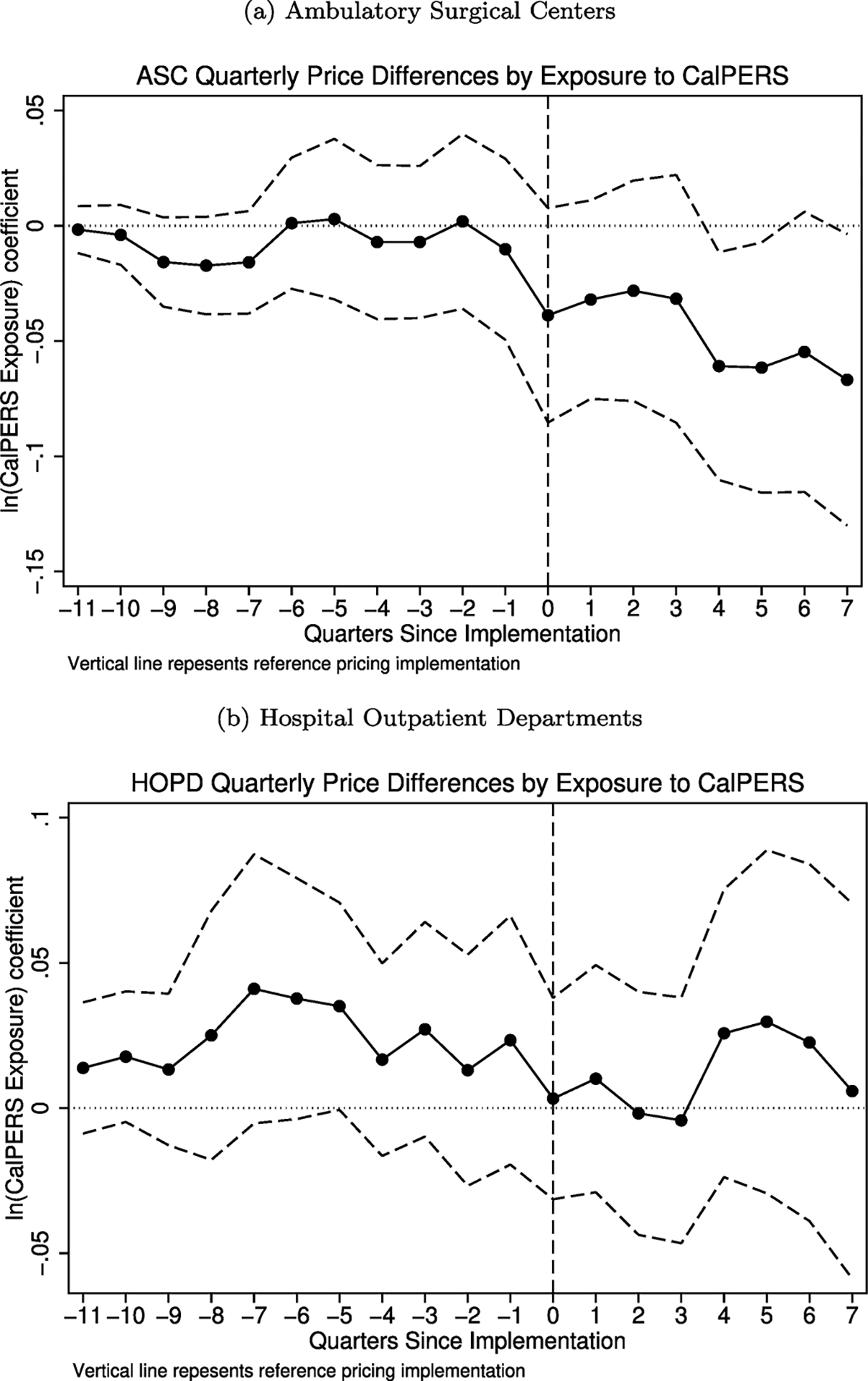
Fig. 5.

Parallel trends test. These figures plot the quarterly association between provider prices and exposure to CalPERS. The solid line represents the log-difference in prices for a 1-unit change in log-exposure to CalPERS. The dashed lines represent a 95% confidence interval. The vertical line indicates the implementation of the CalPERS reference pricing program. The top panel presents results for ambulatory surgical centers, while the bottom panel presents results for hospital outpatient departments.
