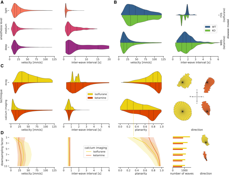
Figure 5.
Quantitative comparison of slow waves across heterogeneous datasets
Violin plots show sample distributions with indications of the median (dashed line) and the quartiles (dotted lines). Line plots also show the median and quartiles (shaded areas). Polar plots show the distributions of wave directions in the right hemisphere so that “up” corresponds to an anterior direction and “right” to a lateral direction.
(A) Velocity and interwave intervals of slow waves in ECoG recordings as a function of the anesthesia level.
(B) Velocity and interwave intervals of slow waves in ECoG recordings of experiments modeling Willems-Beuren syndrome (WBS) and Fragile X syndrome (FXS) split into wild-type (WT; blue) and knockout (KO; green) subjects.
(C) The ECoG data from (B) is compared to calcium imaging data split into anesthetic types, on the basis of wave velocity, interwave interval, wave planarity, and wave direction.
All distributions in (A)–(C) are scaled to have equal height.
(D) Effect of stepwise spatially downsampling the calcium imaging data from 0.05 (factor 1) to 0.55 mm (factor 11; the spatial resolution of the ECoG data) on wave velocity, interwave interval, wave planarity, number of waves, and wave direction. The line graphs denotes the median and the shaded area the 0.25–0.75 quantile of the corresponding distributions. The histograms of wave directions are only shown for the fully downsampled data (with factor 11).

