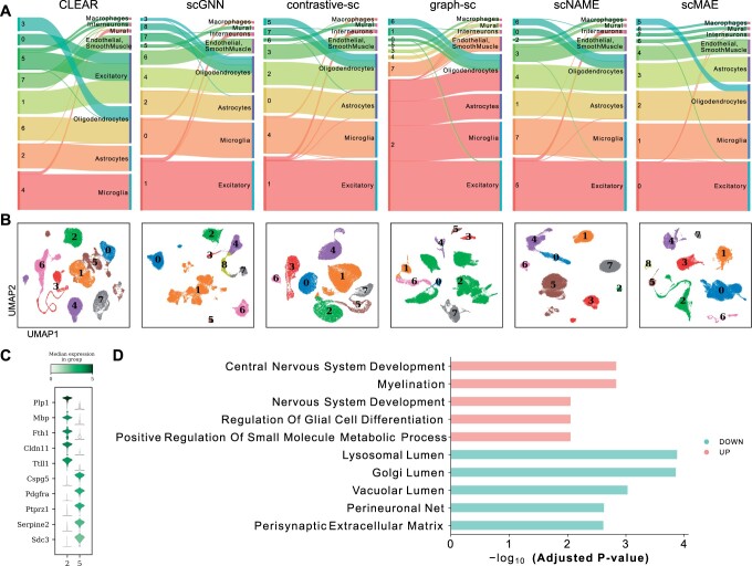
Figure 4.
Biological analysis in the Hrvatin dataset. (A) Sankey plots of clustering results and true cell types for scMAE and comparative methods. For each subplot, the left side represents the clustering labels generated by each method, while the right side represents the true cell types. (B) UMAP visualization of the cell embeddings learned by scMAE and comparative methods. The colors represent the clustering labels assigned by each method. (C) Violin plot showing the differential expression genes of Cluster 2 and Cluster 5. (D) The enriched Gene Ontology (GO) terms in Cluster 2 versus Cluster 5.

