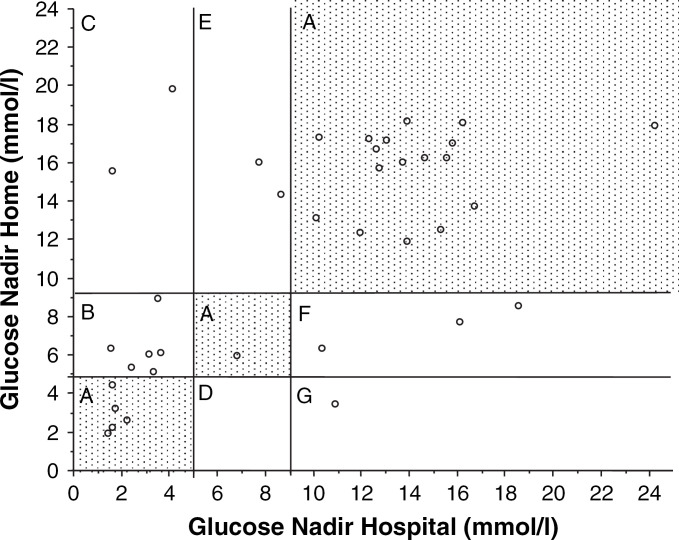
Fig 3.
Graphic representation of the glucose nadirs for all blood glucose comparisons. The x-axis represents values from hospital curves and the y-axis represents values from home curves. In 23 of 37 blood glucose pairs, the decisions regarding treatment were in agreement (zone A). In 14 of 37 pairs, the decision regarding treatment differed in one of five different ways: zone B—hospital curve: decrease insulin; home curve: insulin unchanged; zone C—hospital curve: decrease insulin; home curve: increase insulin; zone D—hospital curve: insulin unchanged; home curve: decrease insulin; zone E—hospital curve: insulin unchanged; home curve: increase insulin; zone F—home curve: increase insulin; home curve: insulin unchanged.

