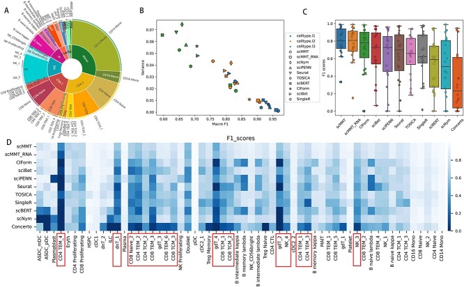
Figure 3.
scMMT accurately identifies rare cell types. (A) Pie graph displays the distribution of cell types at different hierarchy levels in the 160k PBMCs dataset. The inner circle is composed of 8 cell types from the cell type l1 level, the middle circle is composed of 31 cell types from the cell type l2 level and the outer circle is composed of 58 cell types from the cell type l3 level. (B) Scatter plot depicts the distribution of F1 scores for the 10 most effective methods mentioned above. The three distinct colors correspond to three annotation levels, whereas the 10 different shapes represent the 10 methods. (C) Box plot displays the distribution of F1 scores for the 20 rarest cell types, which selected from the cell type l3 level of the 160k PBMCs dataset. Each individual point on the plot represents the F1 score for a specific cell type. (D) Heatmap displays the F1 scores of the 58 cell types within the cell type l3 level of 160k PBMCs dataset. The heatmap shows a progressive increase in the number of cells from left to right, accompanied by a corresponding trend of increasing F1 scores.

