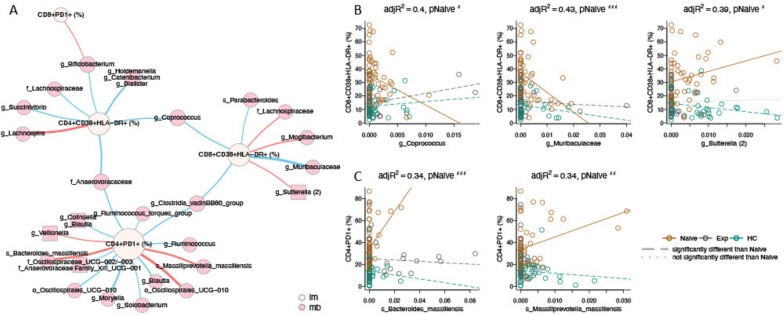
Fig. 6.
Network analysis of immune and microbial associations. A Network summarizing relationships between immune markers (beige nodes) and microbial ASVs (pink nodes) at week 0. Red edges represent positive associations between an immune marker and microbial feature in the ART-naive cohort; blue edges represent negative associations. Edge widths are a function of the p-value on the slope of the ART-naive cohort, with thicker edges representing smaller p-values. Relationships were generated by linear models of the form immune marker ~ microbial feature + microbial feature × cohort, with an additional term for read count of the microbial feature. Relationships in this network are limited to those with an FDR-adjusted p-value on the F statistic of the overall regression < 0.2, adjusted R2 > 0.25, p-value on the slope for the naïve cohort < 0.05 and different from the slope for the experienced cohort and/or the healthy controls (p < 0.05), and maximum absolute value of DFFITS < 2. Names are based on Silva taxonomy [43] assignment for each ASV. Square nodes with more than one listed feature represent highly correlated microbes that were binned using SCNIC [46]. B, C Scatterplots and fitted regression models of associations between CD8 + CD38 + HLA-DR + (B), and CD4 + PD1 + (C) immune cells and microbial features. Each circle represents one person, colored by cohort. Fitted models for each cohort are shown with colored lines, with dashed lines representing slopes significantly different than naïve (p < 0.05), and dotted lines not significantly different than naïve. For all plots, the slope for the naïve cohort is significantly different than zero (pNaive, with significance codes for p-values defined as “***” (0, 0.001), “**” (0.001, 0.01), “*” (0.01, 0.05). Adjusted R2 (adjR2) is provided as a measure of overall model quality

