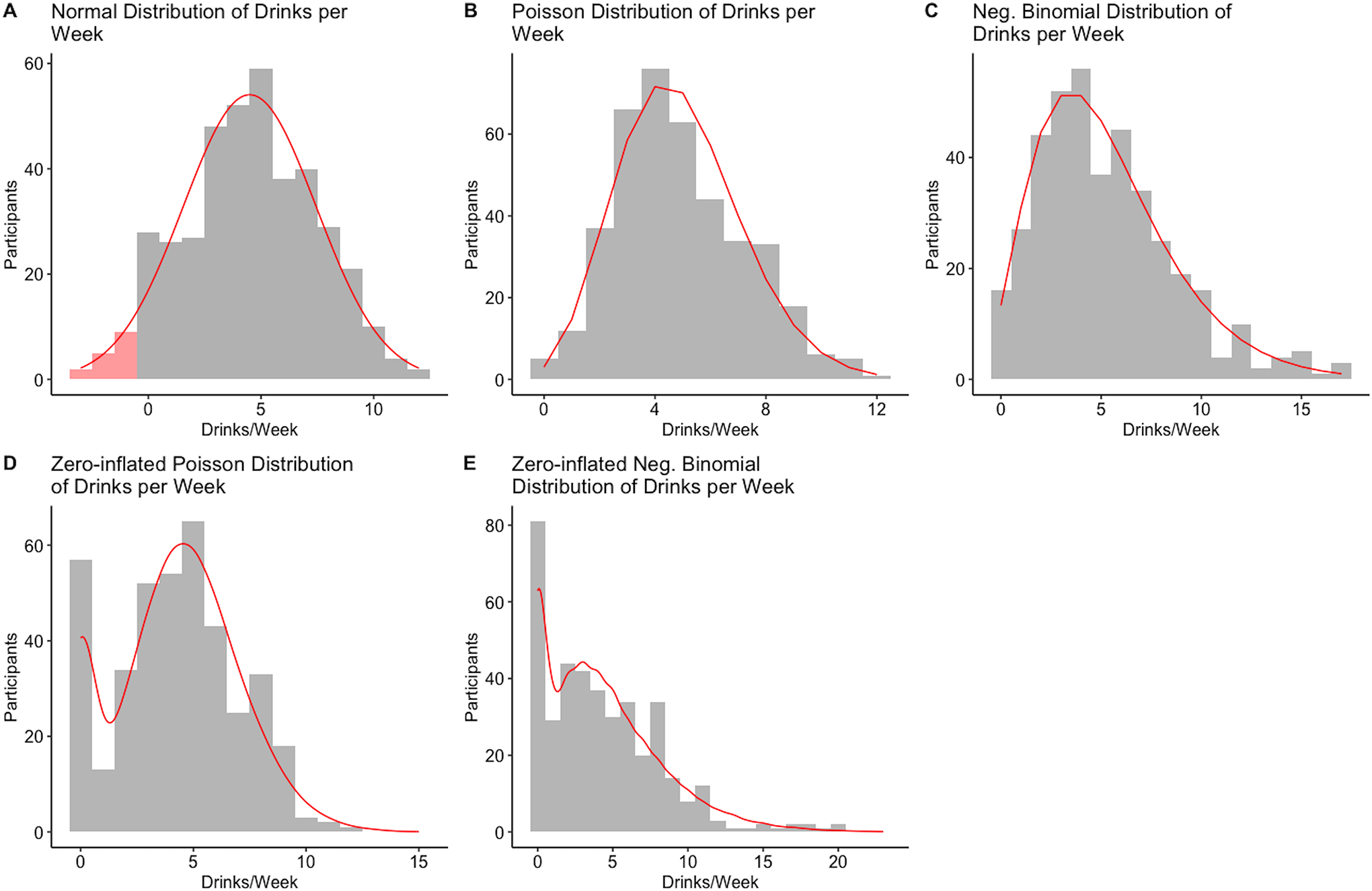
Figure 2.

Visual display of typical count distributions
Notes. All five plots depict a simulated dataset of N = 400. The red curve depicts the expected density of the distribution. Figures 2A – 2E were drawn for the distribution with an average of 5 drinks per week. The red shaded area in the left tail in Figure 2A depicts negative values that would be expected under the normal distribution. The variance of the normally distributed data (2A) was 9. The Poisson data (2B and non-zero part of 2D) were generated with λ = 5. The NB data (2C and non-zero part of 2E) were generated with a mean parameter of 5 and a dispersion parameter of 3. Figures 2D and 2E had 15% zero observations.
