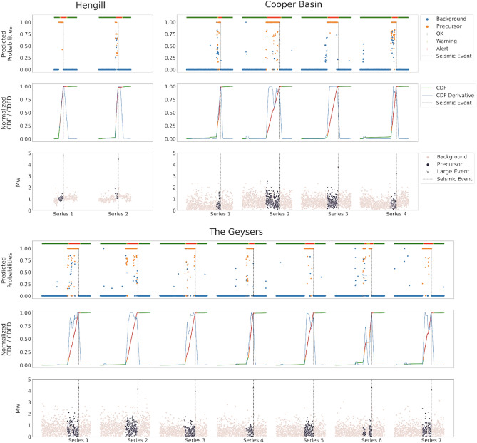
Figure 11.
The results of PreD-Net in the validation set. The upper-left sub-figure refers to the events of the Hengill geothermal field, the upper-right one to samples of the Cooper basin. In the lower sub-figure, the series of The Geysers geothermal field are reported. In particular, for each figure, the upper panel reports the probability a certain earthquake is labelled as a “Precursor” by the PreD-Net (value on y-axis), while the colour indicates the ground truth (blue points correspond to the background samples, orange ones to the precursors). The upper bar represents the three levels of warning: green for no warning, orange for forthcoming alarm and red for a strong alert. The dotted vertical line represents the largest event position in the time-series. In the middle panel, the CDF is represented by the green-orange-red line (also, in this case, the colours follow the warning system). The blue line represents the CDFD, which is the one that affects the early warning. The bottom panel contains the magnitude () of the events, divided into Background (pink points) and Precursors ( dark points).

