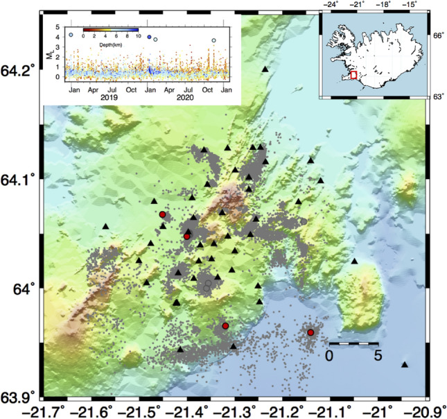
Figure 3.

Characteristics of seismicity at Hengill geothermal area. The epicentral distribution of the earthquakes is represented with a circle: grey dots represent earthquakes with less than 3, grey circle greater or equal to 3, and finally the main events with greater than 3.5 are marked with red dots. The two upper insets show the location map of the Hengill geothermal area and the magnitude temporal distribution, the symbols are coloured according to the depth. The figures are generated by using the version 5 of Generic Mapping Tools (https://www.generic-mapping-tools.org/).
