
Figure 5.
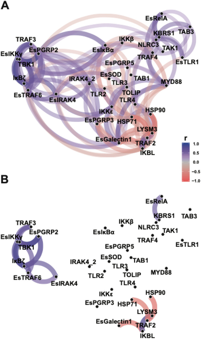
Network plot of Pearson correlation of voom transformed (log-CPM) NanoString assay gene expression counts to visualize gene expression relationships. Genes that are more highly correlated are closer together according to multidimensional clustering of the absolute values of correlation and are joined by stronger paths. Blue paths indicate positively correlated genes whereas red indicates negatively correlated genes. (A) all correlations with r-value ≥ 0.40. (B) highest correlations with minimum correlation r-value ≥ 0.6.