
Fig. 1. Adjusted odds ratio plot comparing neonatal cytokine and chemokine concentrations.
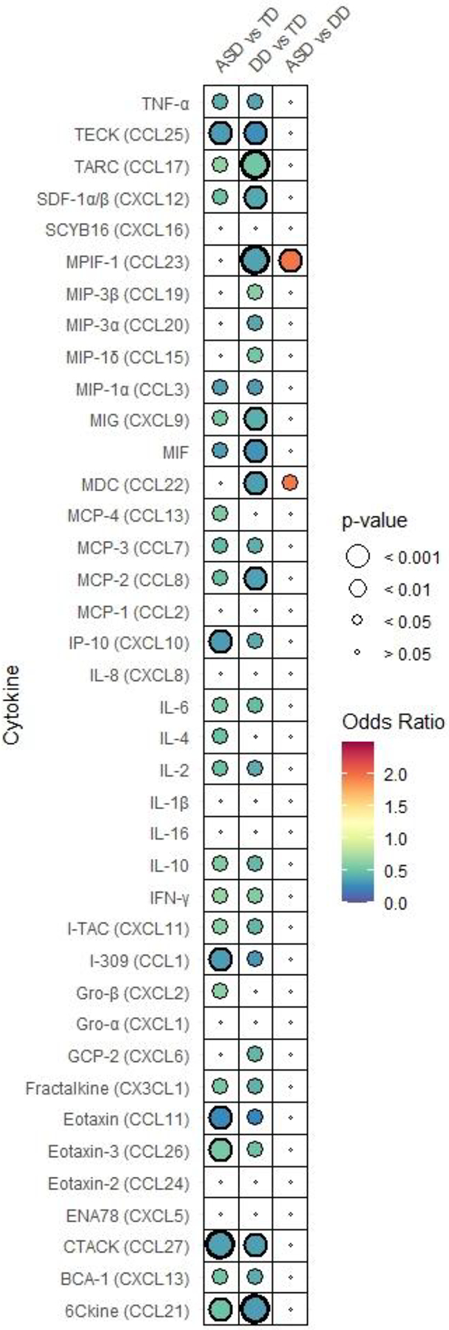
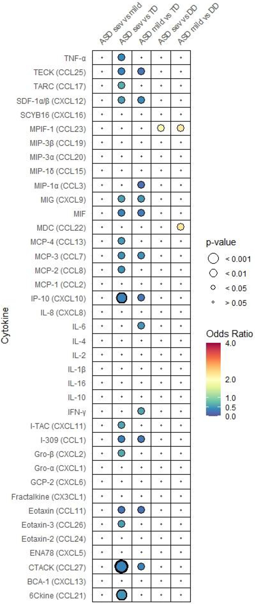
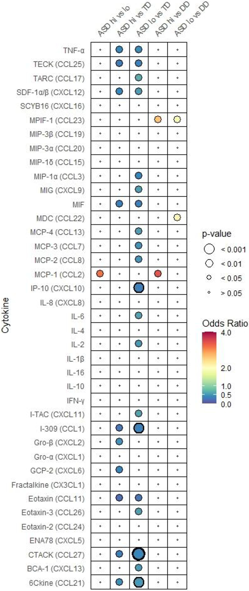
in (A) ASD, DD, and TD, (B) subgroups of ASD (ASDsev, ASDmild), DD, and TD, (C) subgroups of ASD (ASDhi, ASDlo) DD, and TD. Odds ratio is depicted by the heat map with highest ORs in red to lowest in blue. Each figure has its own heat map. Relative P-value is depicted by circle size. P-values that are below 0.001 are bolded.