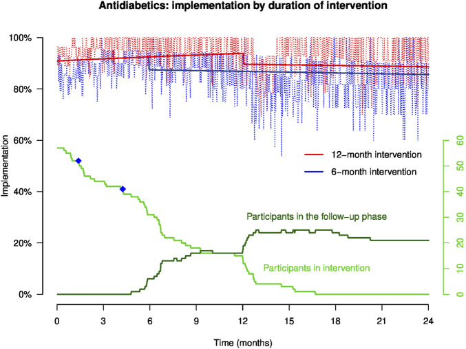
FIGURE 3.
Implementation to antidiabetics in representative patients of groups (A, B) throughout the study. NB: the light red and blue curves show empirical implementation, and the thick red and blue lines represent implementation to antidiabetics modeled by GEE. The green curves represent the number of participants over time in the intervention and the follow-up phases, and the blue dots on the green curve show the moment when patients discontinued at least one of their antidiabetics.

