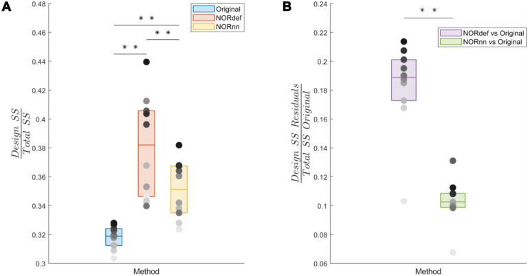
Figure 10. Group analysis of the variance explained by the stimulation design.
A) Box charts show the interquartile percentile range of variance explained by the design in the data across participants. After NORDIC denoising, an increased proportion of the variance is explained by the experimental design. NORnn shows an increase in explained variance compared to the original data, but a slightly lower increase than NORdef. B) The proportion of variance explained by the design that is removed from the Original data after NORDIC. NORdef removed a larger proportion of the signal compared to NORnn. * indicates p<0.05, ** indicates p<0.01.

