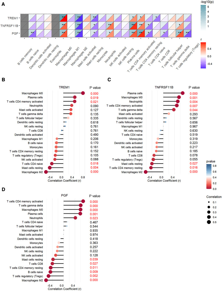
Figure 10.
Pearson's correlation analysis between expression levels of TREM1, TNFRSF11B, and PGF and the proportions of different immune cell types. (A) Heatmap of the correlation analysis. (B) Bubble chart shows correlations between TREM1 expression levels and proportions of different immune cell types. (C) Bubble chart shows correlations between TNFRSF11B expression levels and proportions of different immune cell types. (D) Bubble chart shows correlations between PGF expression levels and proportions of different immune cell types.

