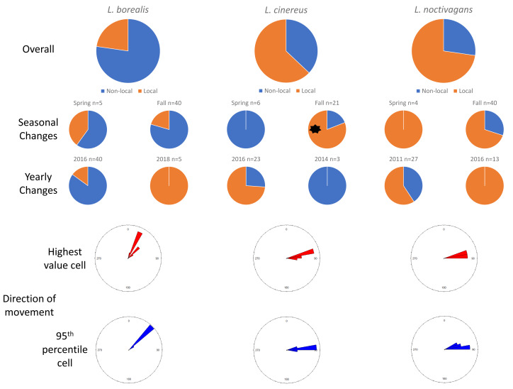
Figure 2. Results for Maryland.
Pie charts showing the changes in proportions of resident (orange) vs migratory (blue) wind-energy facilities mortality in Maryland, including overall mortality, seasonal differences, and yearly changes. In addition, we show the direction of travel from the highest value cell (red) or average 95th percentile (blue) location to the known sampling location for all individuals. Significant differences are highlighted with a black asterisk (*).

