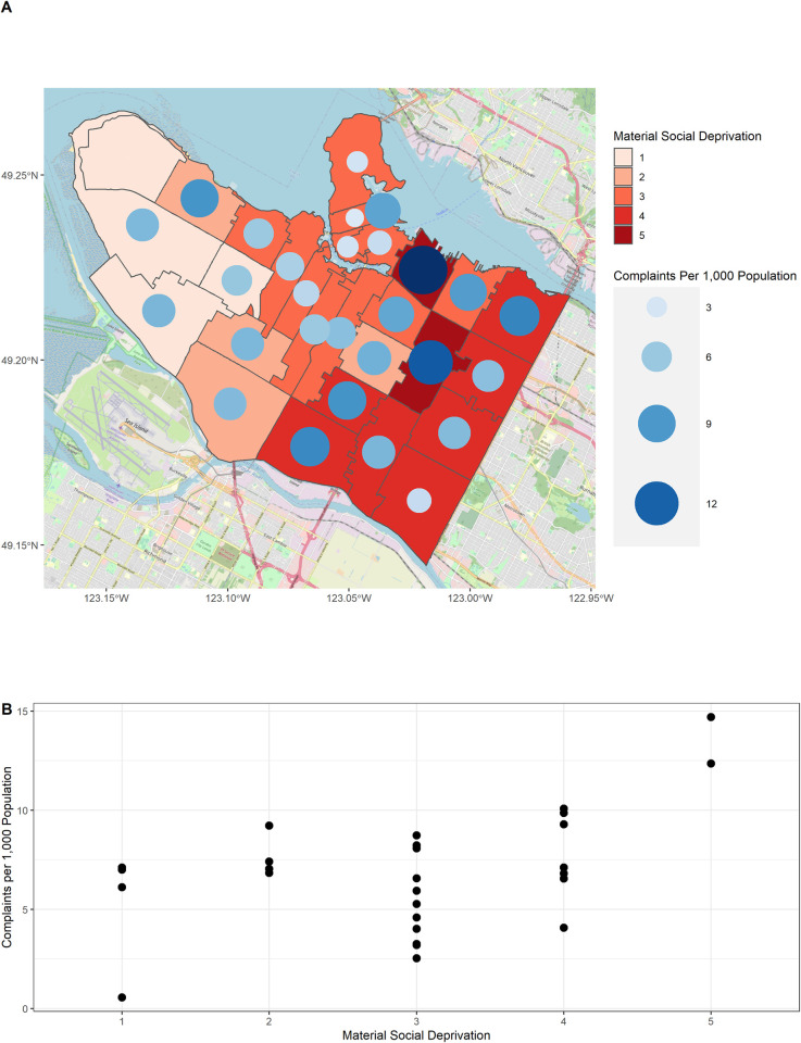
Fig 3. Geographic distribution of complaints.
Panel (A) shows the number of complaints per 1,000 population by forward sortation area or FSA (first three digits of the postal code). FSAs are colored according to the level of deprivation and the size of each circle indicates the number of complaints per 1,000 population. Panel (B) shows a scatter plot of the FSA complaint rate versus deprivation. The background map (A) was sourced from OpenStreetMaps [19].

