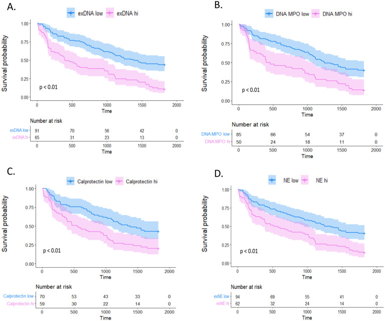
Figure 3.
Kaplan-Meier survival curves in survival cohort. Each pane represents one of the NETosis markers tested within the validation cohort which was divided into high and low NETosis marker levels by optimal cut-off threshold. Patients with NETosis marker levels higher than the optimal cutoff threshold are represented in pink and those with NETosis marker levels below the threshold are in blue. Survival probability is represented by the y-axis and the time to death in days is plotted on the x-axis. Panel A shows results from exDNA: HR=2.57, 95% CI 1.76–3.76, p<0.01; Panel B shows results from DNA-MPO: HR=2.15, 95% CI 1.43–3.24, p<0.01; Panel C shows results from calprotectin: HR=2.00, 95% CI 1.31–3.05, p<0.01; Panel D shows results from NE: HR=2.06, 95% CI 1.41–3.01, p<0.01.

