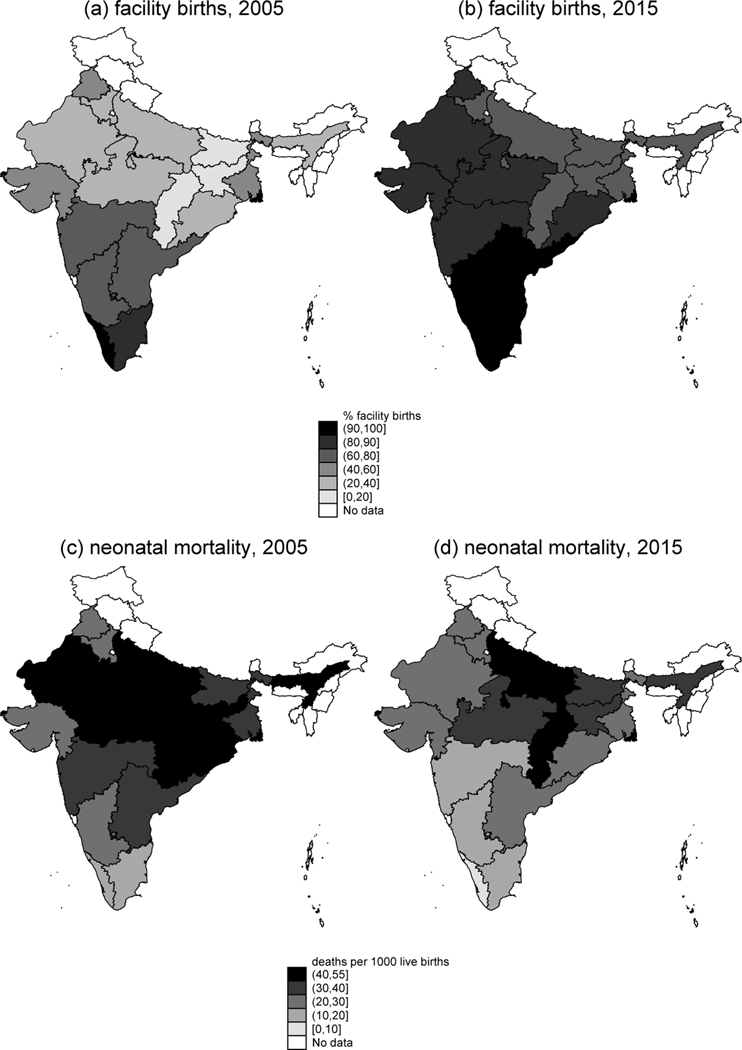
Figure 1: Map of changes in facility birth and NNM in Indian states with greater than 25 million population.
Note: Panels a and b show the percentage of births in the five years before the survey that took place in a health facility, for 2005 and 2015 respectively. Panels c and d show the neonatal mortality rate, in deaths per 1,000 live births, for 2005 and 2015 respectively.

