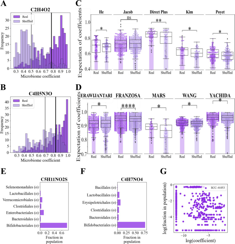
Fig. 2.
The relation between the microbiome and the metabolites is not linear and is dominated by a few taxa. A, B Histograms of the coefficients of the NMF model which relates metabolite concentrations and the microbiome frequencies (real in dark purple) and of a random model with the microbes shuffled before the prediction (light purple) of the metabolite C2H4O2 (A) and C4H5N3O (B). The black line represents the expectation of the real data, and the gray line represents the expectation of the shuffled data. The coefficients of the real model are higher than the coefficients of the shuffled model. Similar results are observed for all the other metabolites as well. C, D Swarm plots of all the expectations of the relative contribution of the coefficients of each metabolite for all the 16S rRNA gene-based (C) and the WGS datasets (D). The expectations of the real models are represented in dark purple dots, while the expectations of the shuffled models are in light dots. Bar plots represent the median of each group. A two-sided t-test was applied between the two models for each dataset. In all the datasets apart from Jacob, the expectations of the real model are significantly higher (p-value than the expectations of the shuffled model. The stars represent the p-values, such that *p-value , **p-value , ***p-value . E, F Bar plots of the frequency of the microbes associated with the 10 highest coefficients in the NMF models of C5H11NO2S (E) and C4H7NO4 (F). There are no consistent patterns. For most metabolites, the most frequent order is not the best predictor. G Scatter plot of the coefficients in the log NMF model of the taxa with the highest coefficients vs. the logged frequency of the same taxa, with no clear correlation between them

