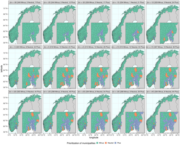
Fig 2. The geographic distribution of municipality prioritization in alternative strategies.
The 356 municipalities are classified into three groups, represented by the colors green (Minus), orange (Neutral), and blue (Plus). Each strategy comprises a different number of municipalities in each group. The baseline strategy (Δn = 0) represents the selection made in the real-world implementation. The shifts of municipality priority Δn are indicated in brackets, and the number of municipalities in each group is shown accordingly in each panel title. The maps were created using two R packages: “rnaturalearth” for country-level data and “fhidata” for Norwegian municipality-level data. All open-source shape files are licensed under Creative Commons BY 4.0 (CC BY 4.0) and CC0 1.0 (No Copyright), respectively. The country-level data is sourced from Natural Earth (https://www.naturalearthdata.com), while the Norwegian municipality-level data was obtained from Geonorge (https://kartkatalog.geonorge.no/metadata/norske-fylker-og-kommuner-illustrasjonsdata-2020-(klippet-etter-kyst)/7408853f-eb7d-48dd-bb6c-80c7e80f7392).

