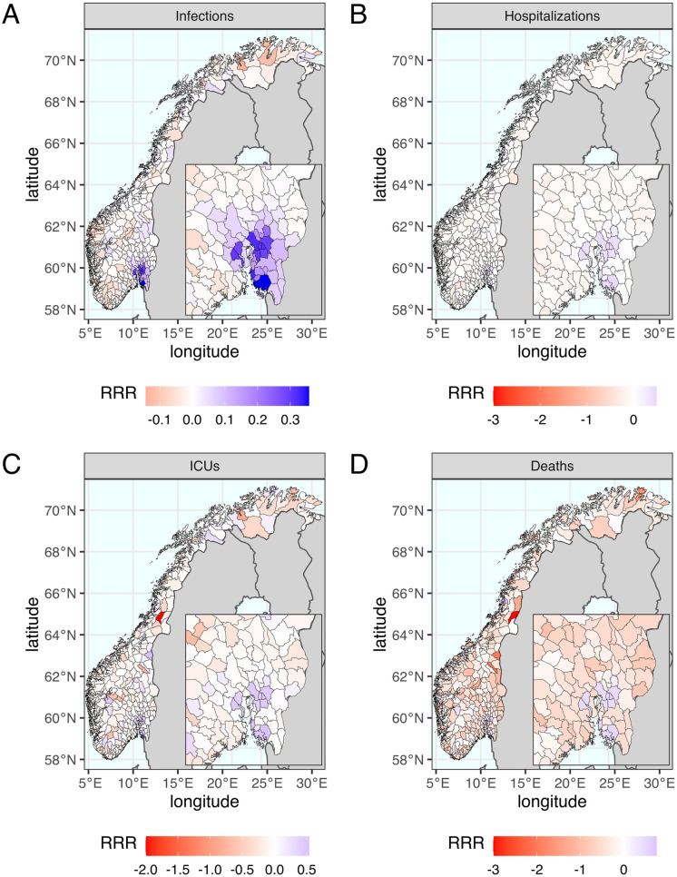
Fig 4. The geographic distribution of mean relative risk reduction (RRR) of the optimal scenario that minimizes infections.
The optimal scenario is the one of reducing the priority by moving 25 municipalities to Minus and giving 300% extra doses (Δn = −25, Δp = 300%). The geographic trade-off between municipalities is illustrated by color from blue to red representing mean values of municipality-specific RRR from positive to negative. The benefits in Oslo and its surroundings are much greater than the drawback in other municipalities to minimize (A) infections, (B) hospitalizations and (C) ICU admissions but not (D) deaths. The maps were created using two R packages: “rnaturalearth” for country-level data and “fhidata” for Norwegian municipality-level data. All open-source shape files are licensed under Creative Commons BY 4.0 (CC BY 4.0) and CC0 1.0 (No Copyright), respectively. The country-level data is sourced from Natural Earth (https://www.naturalearthdata.com), while the Norwegian municipality-level data was obtained from Geonorge (https://kartkatalog.geonorge.no/metadata/norske-fylker-og-kommuner-illustrasjonsdata-2020-(klippet-etter-kyst)/7408853f-eb7d-48dd-bb6c-80c7e80f7392).

