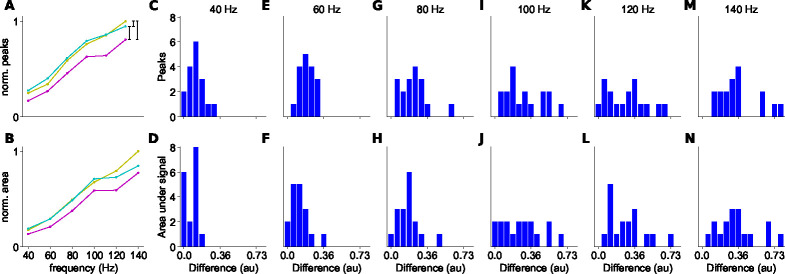
Figure 5. Differences in peak responses and areas between branches.
A: Example of the normalized peak fluorescence as a function of stimulus frequency at a branchpoint. Parent branch in yellow, secondary branch with higher signal in cyan, and secondary branch with lower signal in magenta. B: Normalized integrated fluorescence as a function of stimulus frequency. C-N: Differences between normalized signals (black vertical lines in A), for peak (upper row) and area under the signal (bottom row) different spike trains frequencies (n=17).

