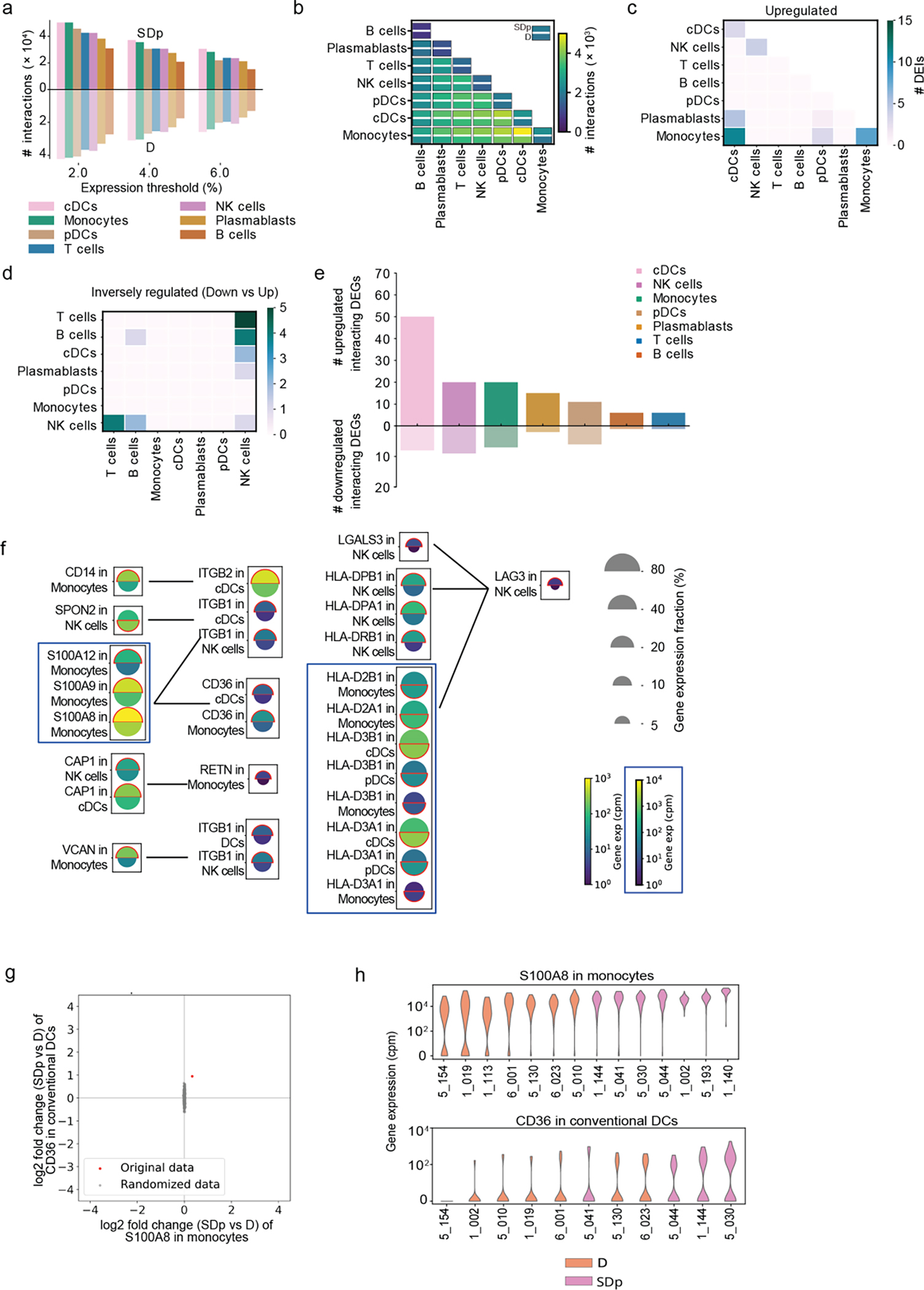
Fig.8: Cell-cell communications are altered in SDp.

a, Bar plot showing the number of candidate interactions in each cell type in SDp (top) and D (bottom) based on different expression thresholds (2%, 4%, and 6%). b, Heatmap showing the number of candidate interactions between the indicated cell types in SDp (top rectangle) and D (bottom rectangle). c, d, Heatmaps showing the number of upregulated and inversely regulated DEIs shown in fig. 6c and 6d, respectively, across cell types. e, Bar plot showing the number of up- and down-regulated interacting DEGs across cell types in SDp vs. D. f, Split dot plots showing gene expression in representative DEIs. Top half of each spilt dot plot depicts the expression level in SDp; bottom half depicts the expression level in D; spilt dot plot size depicts the percentage of gene expressing cells in the cell types indicated; and color depicts gene expression level in counts per million (cpm). Red outline indicates the condition with the higher gene expression. g, Example of label randomization for the S100A8-CD36 interaction. The red dot indicates the log2 fold change of the expression of either gene in the corresponding cell type in SDp vs D. The 1000 gray dots indicate the log2 fold changes after randomly picking SDp and D cells following cell shuffling. The p-value was calculated as the fraction of randomizations for which the distance from the origin was larger than in the real data. h, Violin plots depicting ligand-receptor expression (S100A8-CD36 interaction) in each patient.
