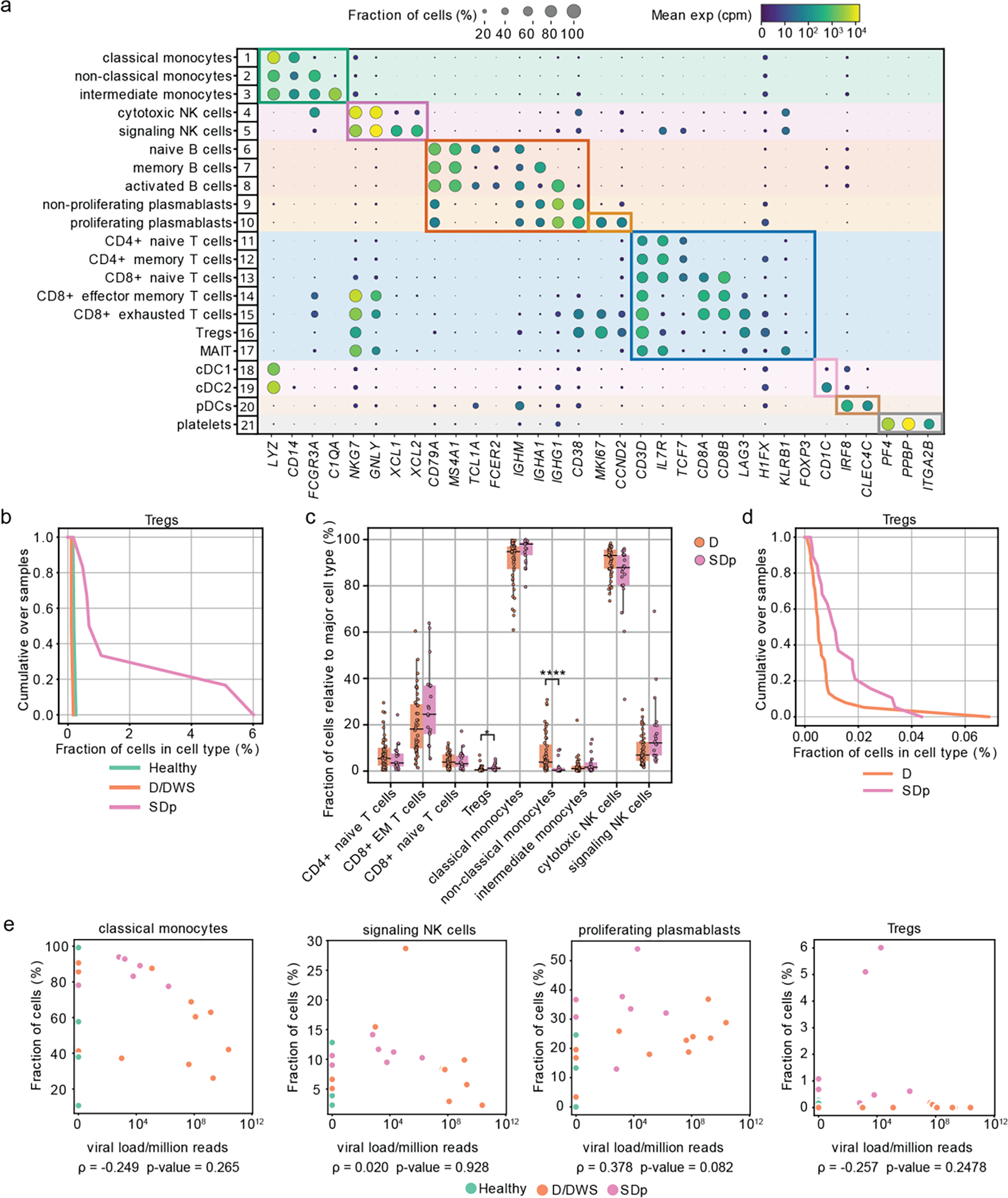
Fig.1: Differences in cell subtype abundance in the viscRNA-seq 2 and CyTOF datasets are comparable and do not correlate with serum viral load.

a, Dot plot depicting examples of marker genes used to annotate the indicated 21 immune cell subpopulations in the viscRNAseq 2 dataset (Fig.1). Dot size indicates the fraction of cells expressing the marker gene; color indicates expression level of the marker gene in cpm; and identification numbers of distinct cell populations refer to the UMAP in Fig.1a. b, Cumulative distribution of Treg fractions within T cells from all patients across disease severity in the viscRNAseq 2 dataset. c, Box plots showing the fractions of cell subtypes within T cells, monocytes, and NK cell populations in 21 SDp and 47 D patients computed from the (publicly available) CyTOF dataset of samples obtained from the same Colombia dengue cohort. Notably, in this reanalysis, samples from patients who presented with SD upon enrollment were excluded from the dataset, leaving only those from SD patients who progressed to SD within several days following enrollment. *p-value<0.05, ****p-value<0.0001 by Mann-Whitney-Wilcoxon test two-sided with Bonferroni correction. Each dot represents an individual patient, color-coded by disease severity. Horizontal lines signify the first, second (median) and third quartiles. d, Cumulative distribution of Treg fractions within T cells from all patients across disease severity measured via CyTOF. e, Scatter plots showing correlations between fractions of classical monocytes, signaling NK cells, proliferating plasmablasts, and Tregs and serum viral load measured by RT-qPCR. Each dot represents a single patient colored by disease severity (H= green; D/DWS= orange; SDp= pink). Spearman correlation coefficients and p-values are shown below each panel.
