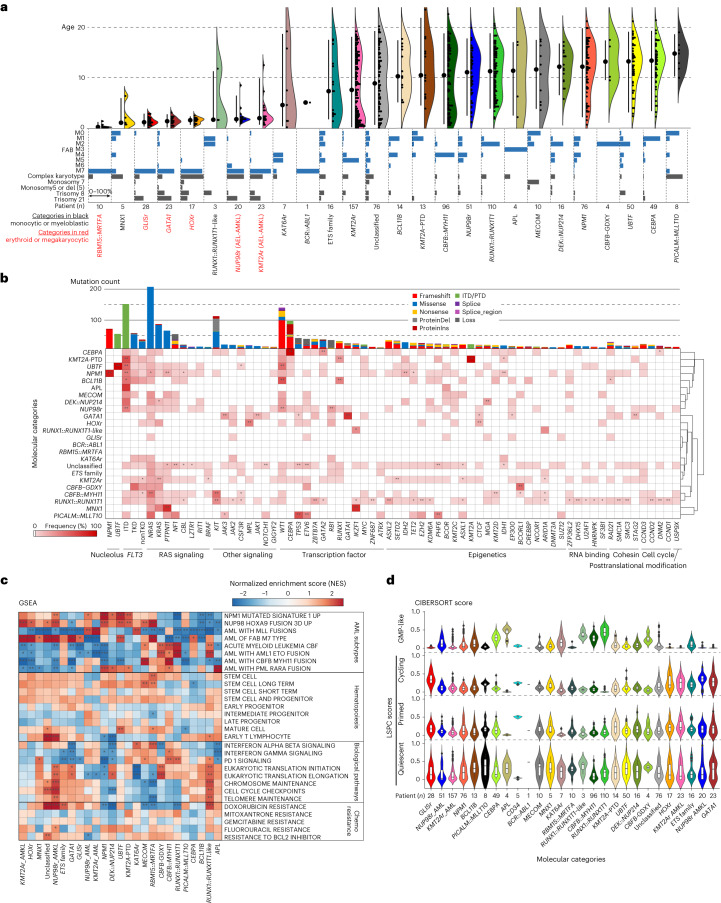
Fig. 4. Clinical and molecular profiles of molecular categories.
a, Clinical background of molecular categories. (Upper) Violin plots showing age distribution within each molecular category. Colors show the molecular categories. Large dots and bars represent the median and the 2.5–97.5 percentile range, respectively. Small dots represent the ages of individuals (n = 887). (Lower) Frequency of FAB classification (blue bars) and karyotype (gray bars) in individual categories. b, Mutational heatmap showing mutation frequencies in each molecular category. The color of each panel represents the frequency of a mutation in each molecular category, and the statistical significance was assessed by two-sided Fisher’s exact test to calculate P values of co-occurrence followed by Benjamini–Hochberg adjustment for multiple testing to calculate q values (*P < 0.05, **q < 0.05 after adjustment). Bars in the upper panel show the frequency of mutations in the entire cohort, and the colors represent mutation types. Molecular categories are clustered according to Ward clustering using the Euclidean distance of the frequency matrix. Genes are grouped according to functional annotations. c, Heatmap showing normalized enrichment scores (NES) and FDR of GSEA for each molecular category. Colors denote NES and asterisks show FDR (*FDR < 0.05, **FDR < 0.01, ***FDR < 0.001). Detailed results are found in Supplementary Table 14. d, Violin plots showing cellular hierarchy scores in each molecular category inferred by CIBERSORT. The colors show molecular categories. The lines of the boxes represent the 25% quantile, median and 75% quantile. The upper whisker represents the higher value of maxima or 1.5× i.q.r., and the lower whisker represents the lower value of minima or 1.5× i.q.r. Dots show outliers. LSPC, leukemic stem and progenitor cell.

