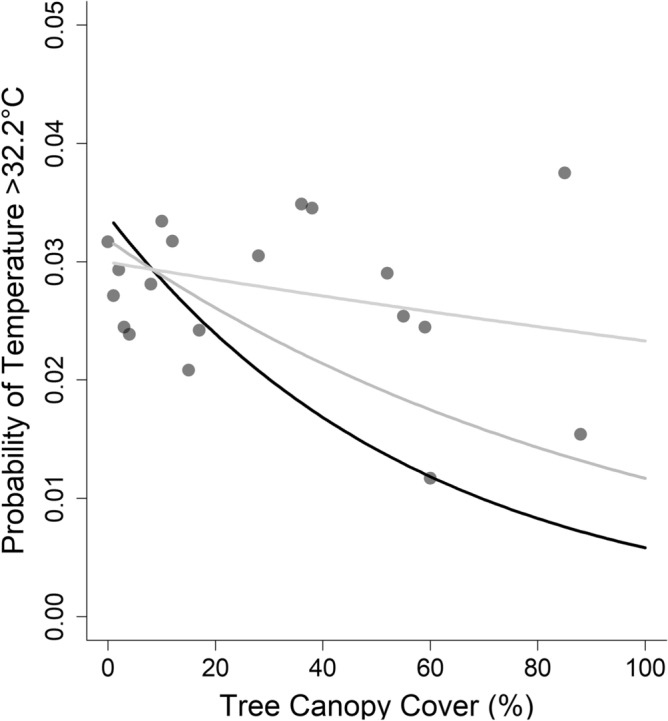
Figure 3.

Probability of high heat events (> 32.2 °C) declined as canopy cover increased; the effect was weaker at higher elevations (i.e., the model included a significant interaction between canopy cover and elevation). To visualize this interactive effect, we show three lines, each representing a different elevation: the black line represents the estimated relationship between probability of high heat and canopy cover at 40 m above sea level; dark gray line is 60 m above sea level, and the light gray line is 80 m above sea level. Points represent the probability of high heat events at each location where we measured temperature (i.e., each utility pole). See Table 2 for model summary statistics, and Fig. S1 for a similar plot, using a high heat threshold of 26.7 °C.
