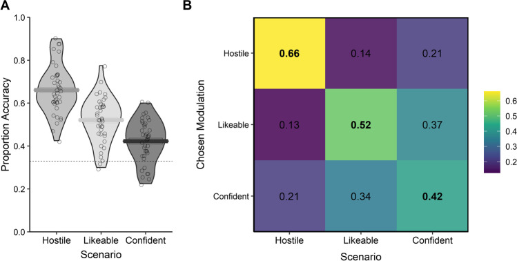
Fig. 4.
Proportion of responses for each trait modulation and corresponding accuracy for Experiment 3. (A) Violin plot showing the accuracy of response for each listener by modulated trait. Horizontal bars show the mean accuracy for the relevant modulated trait category across listeners. The dashed lines represent chance performance. (B) Confusion matrix showing the proportion of each trait selected (chosen modulation) to match each modulated trait scenario (scenario) across listeners and speakers

