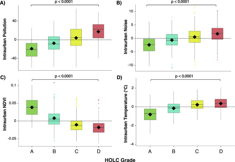
Figure 2.
Redlined neighborhoods disproportionately face worse intraurban disparities in environmental hazards than nonredlined neighborhoods. Intraurban disparity analysis for (A) overall pollution burden, (B) noise pollution, (C) vegetation (NDVI*), and (D) temperature across HOLC grades. Horizontal zero line represents no difference between the city’s average and a neighborhood’s average environmental hazard. For graphs A–D, values above the line represent a higher environmental hazard value (i.e., higher pollution, more noise, and elevated temperature) than the corresponding cities average. For graph C, values below the line represent less vegetation value than the corresponding cities average. Black diamonds represent the mean and whiskers represent 95% confidence intervals. *NDVI = Normalized Differentiated Vegetation Index.

