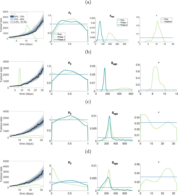
Fig. 6.
Results for pancreatic cancer dataset: a–d represent the results for the first to fourth mouse in pancreatic cancer dataset. The first plot in a–d shows the posterior predictive distribution, the green line shows the scaled posterior distribution for used to indicate the switching time of tumour growth, the true density for posterior is in final plot of (a)–(d). The second and third plots for a–d show the marginal posterior for and in two phases. The horizontal blue lines represent the prior distribution (colour figure online)

