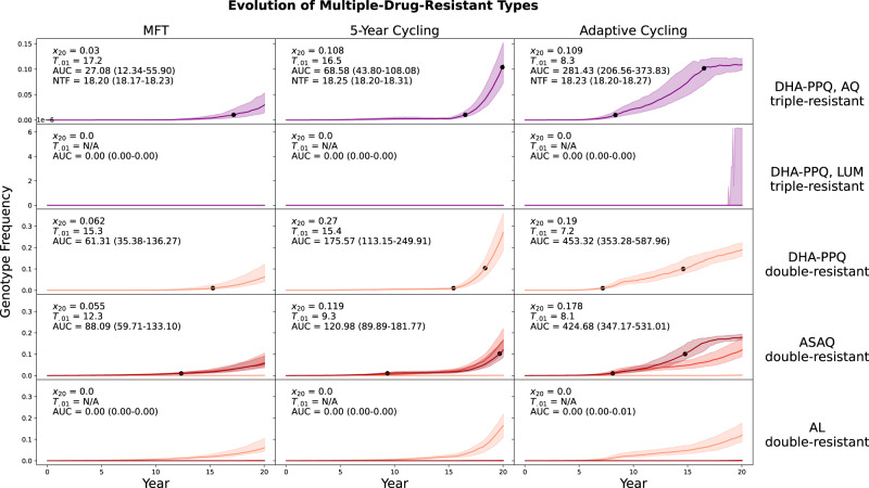
Fig. 2. Evolution of multi-drug resistance under three drug deployment strategies.
Epidemiological scenario shown is 5% PfPR2-10 and 40% treatment coverage. Each row shows the genotype frequency of triple or double resistance to a particular set of antimalarial drugs, with the most resistant genotypes shown in purple (top two rows) or dark red (bottom three rows). In the bottom two rows, medium red corresponds to triple-mutant double-resistance and light red corresponds to double-mutant double-resistance. Median line is shown and interquartile ranges are shaded. No importation is allowed in these figures. Black dots are 0.01 and 0.10 frequency markers for the maximally resistant genotypes. The columns show three different treatment strategies. The outcome measures are the genotype frequency of the maximally-resistant genotype after 20 years (x20), the time until the maximally-resistant genotype reaches 0.01 frequency in the population (T.01), the total area under the frequency curve of the maximally-resistant genotype (AUC), and the total number of non-discounted treatment failures during the twenty years that a strategy is implemented (NTF). AUC is the most appropriate measure of total MDR risk, and the first, third, and fourth rows show that an MFT strategy generates 27% to 65% less risk than the more optimal cycling strategy. The second and fifth rows show a median value of AUC = 0.0 frequency-days for the maximally-resistant genotypes, for all three drug-distribution strategies.

