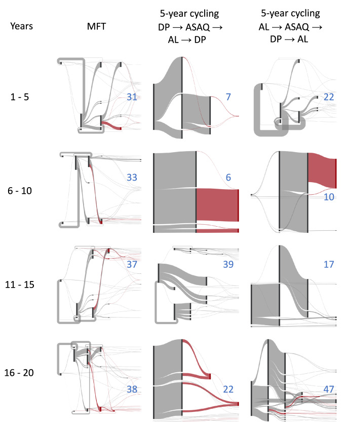
Fig. 7. Mutation flow diagrams for median MFT and 5-year cycling simulations, separated into four 5-year periods.
PfPR2-10 is 5% and treatment coverage is 40%. Two different 5-year cycling strategies are explored (middle and right columns) with different ordering of ACT deployment. Mutation occurs left to right in the diagrams (but the x-axis here is not time) and the width of the flow is proportional to the absolute number of mutations occurring during the five-year period. The crimson-colored flows show evolution towards the maximally-resistant double-resistant genotypes (bottom three rows of Table 1). All other flows are shown in gray. The blue numbers in each panel show the number of ‘destination genotypes’ for the mutation and within-host-selection process; in other words these are the genotypes being selected for during each period. MFT shows more diversifying selection while 5-year cycling shows more unidirectional selection.

