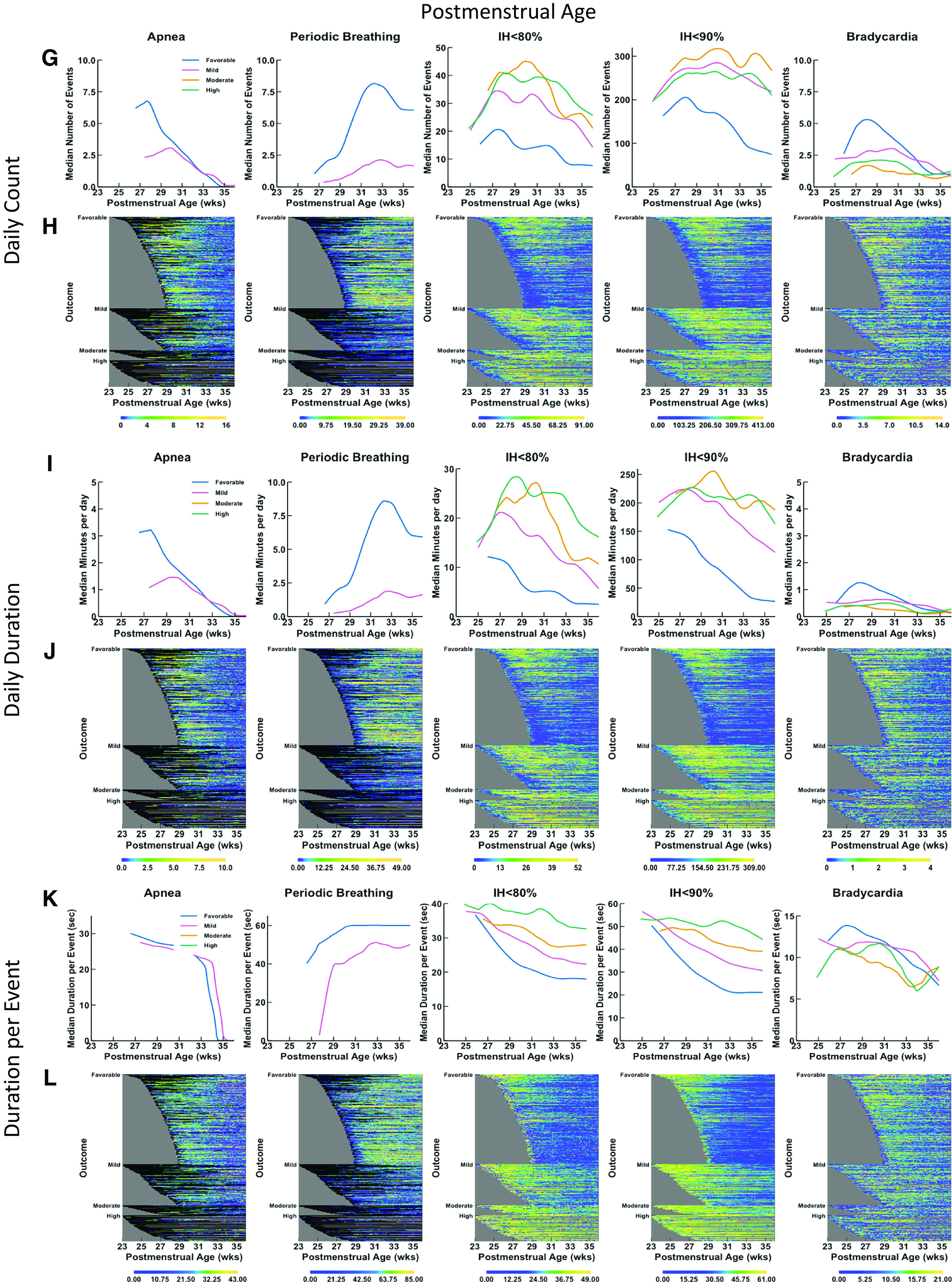
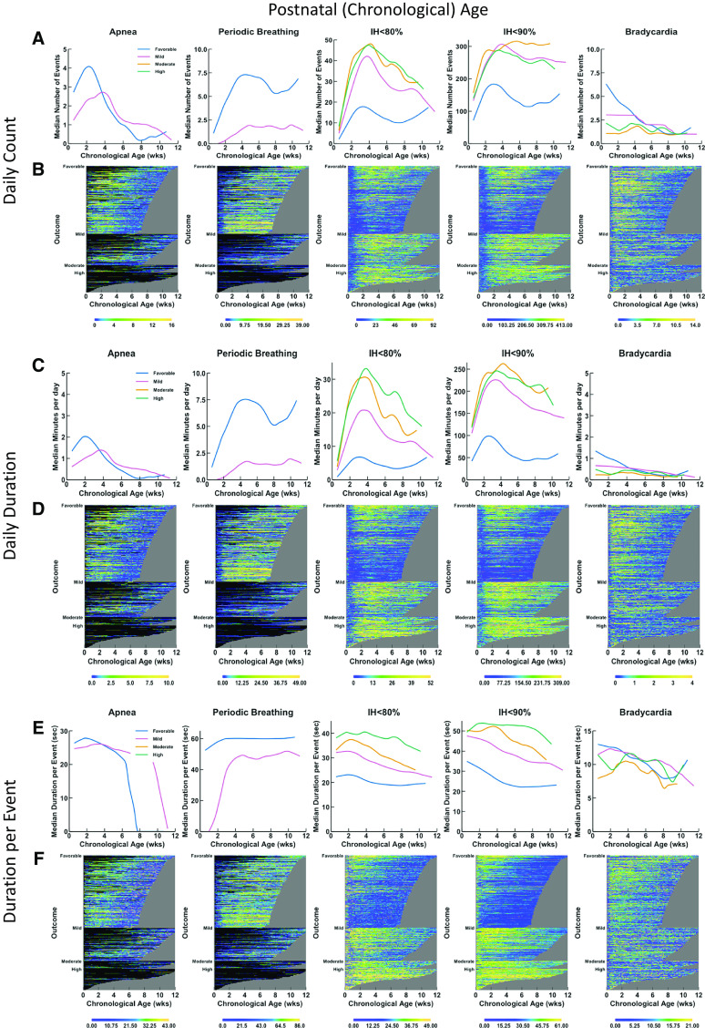
Figure 2.

Trajectories and heat maps for daily counts, daily duration, and median duration per event of apnea, periodic breathing, intermittent hypoxemia (IH) ⩽80%, IH ⩽90%, and bradycardia for infants enrolled in Pre-Vent. Chronologic (postnatal) age is shown on the x-axis in the left panels (A–F) and postmenstrual age is shown on the x-axis in the right panels (G–L). Data are shown from 3 days of age, and a minimum number of 30 infants was required to calculate a trajectory curve. Only infant days that have at least 12 hours of signal available are included. Top row of graphs (A, G) and heatmaps (B, H) show data for daily counts, whereas the middle row of graphs (C, I) and heatmaps (D, J) show data for daily duration of events, and bottom row of graphs (E, K) and heatmaps (F, L) show data for median duration per event. The top row of graphs (A, G) shows trajectories of daily count of event by outcome (color-coded lines), with the number of events on the y-axis and age on the x-axis. The second row of panels shows heatmaps (B, H) for daily counts of events. The heat map shows data for all infants, with each infant per horizontal line, grouped by outcome as favorable (at top), mildly unfavorable (in middle), and moderately or highly unfavorable (at bottom). Within each category of outcome, infants are grouped by gestational age with oldest infants at the bottom and youngest infants at the top, with the data plotted horizontally by chronological age on the x-axis. Color coding for number of events per day is shown with yellow indicating more events and deepening shades of blue indicating fewer events. Black indicates no data, such as for apnea or periodic breathing when the infant is on a ventilator. The gray area represents data truncation when the infant has reached 36 weeks, 6 days postmenstrual age, the predetermined endpoint for the Pre-Vent physiologic outcomes analysis. The middle row of graphs (C, I) shows trajectories of daily duration of event by outcome (color-coded lines), with the number of events on the y-axis and the age on the x-axis. The second row of panels shows heatmaps (D, J) for daily duration of the events. The lower row of graphs (E, F) shows trajectories of median duration per event by outcome (color-coded lines), with the number of events on the y-axis and the chronologic age on the x-axis. The bottom row of panels shows heatmaps (F, L) for median duration per event.

