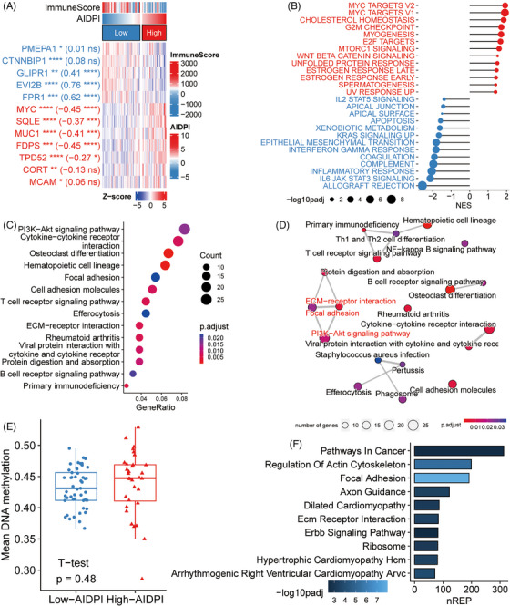
FIGURE 3.

Identifying dysregulated pathways in high‐artificial intelligence‐derived prognostic index (AIDPI) patients. (A) A heat map elucidates the expression of the AIDPI genes and their correlation with the immune score. Stars preceding brackets indicate adjusted p‐values from differential expression analysis (DEA), whereas numbers and stars within the brackets convey the correlation coefficient and associated p‐value, ns: p > .05; *p < .05; **p < .01; ***p < .001; ****p < .0001. (B) Gene set enrichment analysis (GSEA) results spotlight biological processes notably correlated with high (red) or low (blue) AIDPI. (C) A bubble plot shows findings from KEGG enrichment analysis based on differentially expressed genes (DEGs). (D) An enrichment map arranges enriched terms into a network, connecting the terms that have shared genes. (E) Boxplot contrasts average DNA methylation levels between two AIDPI groups. (F) A bar chart manifests empirical Bayes GSEA results based on epigenomic data. nREP, number of genes enriched in this pathway.
