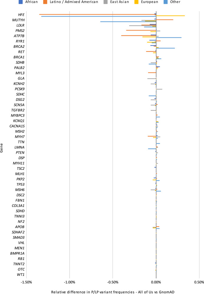
Fig. 2. Relative positive rates for All of Us vs gnomAD.
This figure shows relative frequencies of previously-curated pathogenic or likely pathogenic variants between the All of Us cohort and gnomAD, broken down by gene and ancestry group. Overall, there is a high level of concordance between variant frequencies of pathogenic variants; most genes show very small differences relative to gnomAD. Ancestries are shown as Dark blue for African, Orange for Latino / Admixed American, Gray for East Asian, Yellow for European and light blue for Other.

