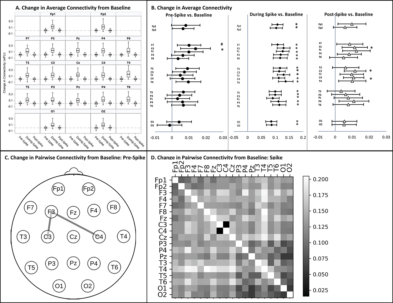
Figure 4: Change in Connectivity from the Spike-Free Baseline during the Pre-Spike, Spike, and Post- Spike Epochs in Children with Self-Limited Epilepsy with Centrotemporal Spikes (SeLECTS).

A. Median change in average connectivity between the pre-spike, spike, and post-spike epochs from the remote, spike-free baseline by electrode. Dotted line indicates no change from baseline. Box plots illustrate the median, interquartile range and 95% distribution of data. B. Forest plots show electrodes with significant increases in average connectivity from baseline during the pre- (circles), spike- (diamonds), and post-spike (triangles) epochs. The vertical gray line indicates no change from baseline. Significant increases in connectivity indicated by * (p<0.0026); connectivity increases trending toward significance indicated by # (p<0.005). No electrodes showed a significant decrease in connectivity from baseline. C. Topographic plot showing electrode pairs with a significant increase in pairwise connectivity from baseline (p<0.0003) in the pre-spike epoch. D. Heat map illustrating increases in connectivity from baseline between all electrode pairs, with brighter boxes indicating greater connectivity increases. The diagonal has been left white. No electrode pairs experienced a decrease in connectivity compared to baseline. The increase in connectivity was significant during the spike epoch for all pairs (p<0.0003) except C3-C4. Changes in pairwise connectivity in the post-spike epoch are not depicted as they were not significant. Connectivity was quantified using the weighted Phase Lag Index (wPLI).
