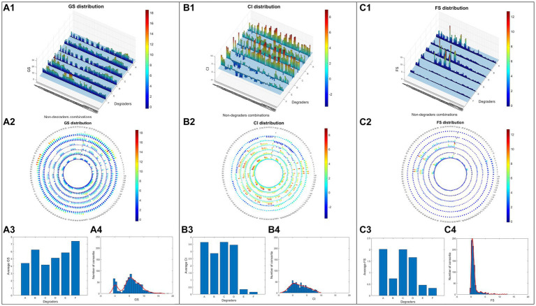
Figure 3.
Screening data of 768 different consortia. Growth score data (GS) were visualised in the bar chart (A1), polar plot (A2), average values under 6 different degraders (A3) and demonstration of GS value distribution via histogram (A4). The same visualisations are also adopted for parameters CI (B1–B4) and FS (C1–C4).

