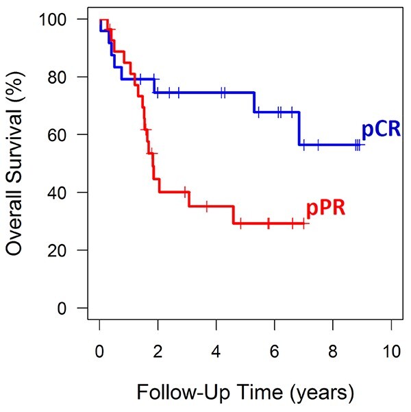
Fig. 2.

Overall survival stratified by pathologic response status. Kaplan–Meier curves were plotted to show the difference in survival between patients with pathologic complete response (pCR, blue curve) and pathologic partial/poor response (pPPR, red curve).
