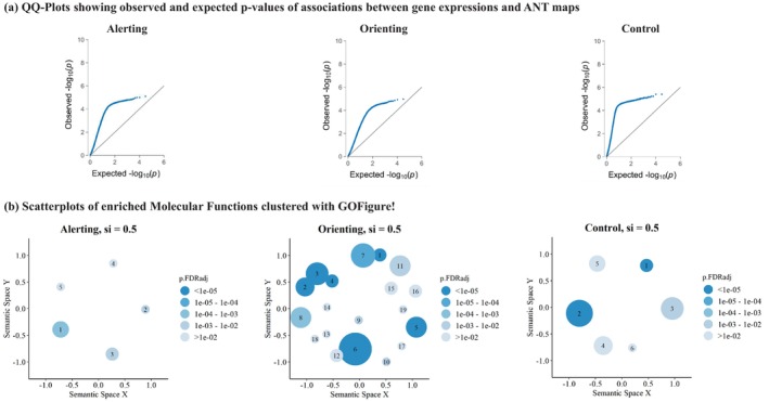
FIGURE 3.

QQ‐plots in panel (a) display permutation‐based p‐values for all 15,632 genes. These p‐values were derived by associating the gene expression map from abagen with the ANT activation maps and comparing them to gene associations of 1 million rotated ANT activation maps. On the y‐axes, we present observed permutation‐based p‐values, plotted against the expected p‐value distribution under the null hypothesis on the x‐axes. Notably, leftward deflections (indicated by blue dots) from the projected null (diagonal line) signify an enrichment of low p‐values. GO‐Figure! plots in panel (b) summarize enriched MFs from GSEA. We have included all significant MFs (p < .05, FDR corrected) in the creation of these summary visualizations with GO‐Figure. Each cluster's color represents the p‐value of the selected representative, while the size of the circles indicates the number of MF assigned to the cluster. Spatial distances between clusters reflect their semantic similarity. For this analysis, we specified a maximum of 20 clusters, a default similarity cut‐off of si = .50, and restricted the analysis to molecular functions. The similarity cut‐off is a parameter between 0 and 1, determining the degree of semantic similarity necessary for two GO‐terms within the Gene Ontology to be assigned to the same cluster. Labels of the cluster's representatives are given in Table 2.
