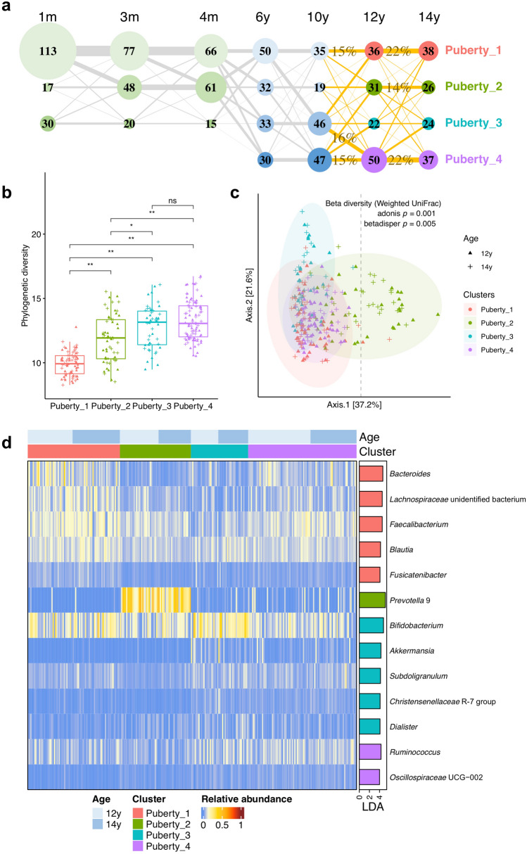
Fig. 1.
Microbial clusters. a Transition between microbial clusters in the first 14 years of life. Microbial clusters were determined by the DMM clustering method according to their compositional characteristics at the genus level. The clusters in infancy (i.e., ages of 1, 3, and 4 months) and middle childhood (i.e., ages of 6 and 10 years) were reported previously [8], and the clusters in puberty (i.e., ages of 12 and 14 years) were determined in the present study. Microbial clusters are presented as nodes, with the size and the number indicating how many samples belong to the corresponding cluster. The four pubertal clusters are colored in pink, grass green, lake blue, and purple, respectively. Transition rates between clusters were calculated based on complete case samples and are shown as sized lines. There are N = 130 completed cases between age 10 and age 12, and N = 116 completed cases between age 12 and age 14. The lines from ages 10 to 14 are highlighted in orange, accompanied with transition rates (> 10%) in percentages. b Phylogenetic diversity of pubertal microbial clusters. Box plots show interquartile ranges and median values. Whiskers indicate 1.5 times the interquartile ranges. Wilcoxon tests were implemented between clusters with the FDR correction (adjusted p: ns, not significant; * < 0.05; ** < 0.01). c Beta diversity between pubertal microbial clusters. It was calculated by weighted UniFrac distance based on relative abundance data of genus-level microbial taxa. Ellipses represent 95% confidence intervals for pubertal clusters assuming a multivariate normal distribution. d Differentially abundant genus-level taxa between microbial clusters in puberty. These taxa were identified through LEfSe (Linear discriminant analysis Effect Size) with FDR-adjusted p < 0.05 and LDA (Linear discriminant analysis) effect size > 4. Taxon relative abundances in individuals are shown in the heatmap on the left side. The barplot on the right side represents LDA scores, with colors indicating enriched clusters

