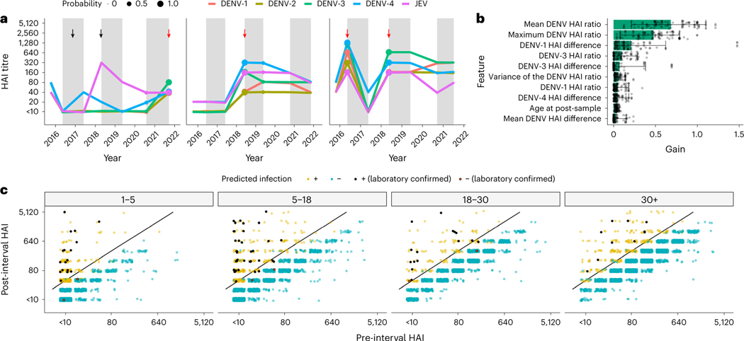
Fig. 2 |. Model performance and fit.
a, Three examples of HAI titre trajectories for all four DENV serotypes and JEV in three participants. Alternating white and grey time periods represent distinct intervals, separated by the sampled HAIs. The imputed probability of an infection having occurred within an interval is represented by point size at the post-interval sample date, and red arrows represent an imputed infection. The black arrows represent JEV vaccination events. b, Feature importance for model fits (n = 100). Gain represents the relative contribution of each feature. The bars represent the mean, and the whiskers represent the 95% credible intervals. c, Pre- and post-interval HAI titres for the DENV serotype with the largest ratio grouped by age at the post-interval sampling event and coloured by whether the model predicted a seroconversion. The yellow and blue dots represent points that were or were not identified as infections, respectively, by the model, and the black and red points represent a similar dichotomy but in laboratory-confirmed seroconversions. A fourfold increase in titres between samples is represented by the black diagonal line.

