Figure 3.
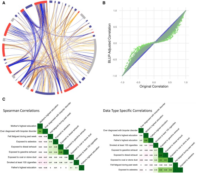
(A) Overall exposome globe for all surveys. The colors around the edge of the globe indicate the survey from which the sections come. The lines represent pairwise positive (blue) and negative (orange) correlations. Interactive globes can be viewed on the PEGS Explorer website. (B) We calculated correlations using appropriate methods for the data types in each variable pair and then shrunk the correlations to control for sample size (small = green; large = blue) by fitting a best linear unbiased prediction (BLUP) model. Original correlations (x-axis) and shrunken correlations (y-axis) are plotted for roughly 3.6M pairwise correlations. (C) Differences correlations calculated using Spearman’s rank correlation coefficient (left) and appropriate methods for the specific variable types (right) are shown for exemplar exposures in the External Exposome Survey.

