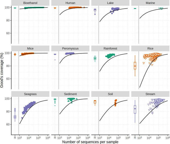
Fig 7.
Most data sets are sequenced to a level that provides a high level of coverage. Each plotting symbol represents the observed Good’s coverage for a different sample in each data set. The box and whisker plot indicates the range of coverage values when the observed community data were normalized by rarefaction to the size of the least sequenced sample. The smoothed line indicates the simulated coverage for varying levels of sequencing effort when a null community is generated from the observed data.

