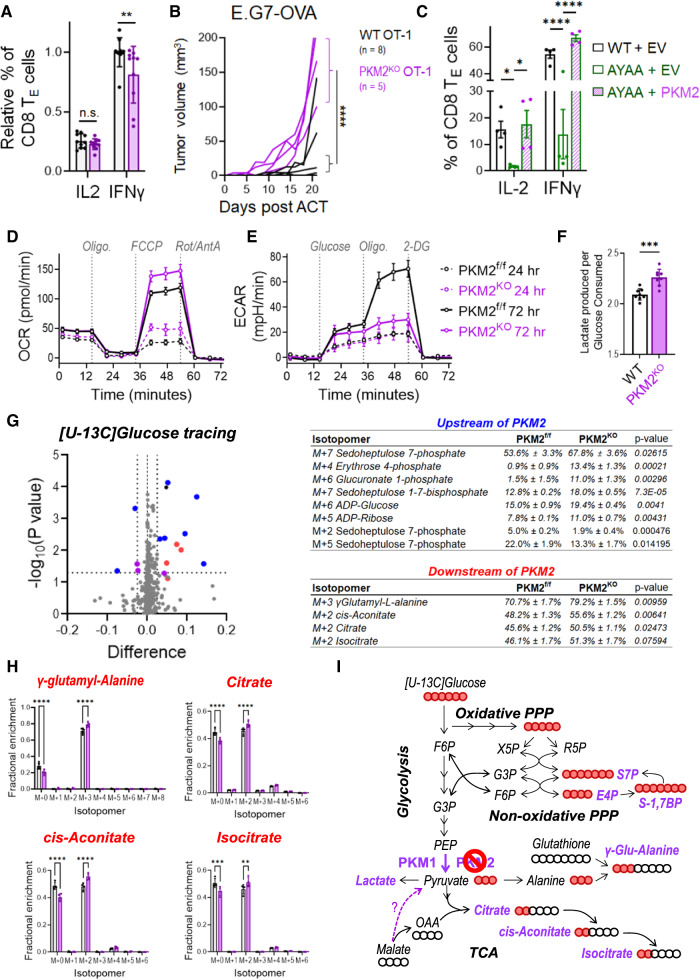
Fig. 4.
Influence of PKM2 on CD8+ T-cell antitumor function and metabolic reprogramming. A IFNγ and IL-2 expression in activated PKM2f/f and PKM2KO TE cells (CD8+CD44+CD62L−) after 72 h of ex vivo activation. B Growth of subcutaneous E.G7-OVA tumors following ACT with WT (black line) or PKM2KO (purple line) OT-1 TCR-transduced CD8+ T cells. The growth of isogenic EL4 control tumors from cells implanted into opposite flanks is shown in Supplementary Fig. 5G. C Rescue of IFNγ and IL-2 expression in activated CD28AYAA TE cells by ectopic expression of PKM2. D Seahorse Mito Stress Tests were performed on PKM2f/f (black lines) and PKM2KO (purple lines) T cells 24 h (dashed lines) and 72 h (solid lines) after activation with αCD3/αCD28-coated microbeads + rIL-2. E Seahorse Glycolysis Stress Tests were performed as described in (D). F The ratio of lactate produced to glucose consumed was measured in the culture medium of WT and PKM2KO T cells on day three of activation. G Volcano plot depicting differences in the fractional enrichment of metabolite isotopomers labeled with [U-13C] glucose in Day 3 activated PKM2KO compared with PKM2f/f CD8+ T cells. The blue dots represent differentially labeled metabolites upstream of PKM2, the red dots represent metabolites downstream of PKM2, and the purple dots represent differentially labeled nucleotides. The tables on the right show the fractional enrichment of differentially labeled metabolite isotopomers upstream and downstream of PKM2. H Increased 13C-glucose labeling of isotopomers of metabolites downstream of PKM2 in Day 3 activated PKM2KO CD8+ T cells. I Diagram of metabolic pathways altered in Day 3 activated PKM2KO CD8+ T cells. The abundances of the indicated isotopomers of the metabolites shown in purple were significantly increased in Day 3 activated PKM2KO CD8+ T cells. The solid red balls represent 13C carbons, and the empty balls represent 12C carbons. The bars in (A, C, F, H) indicate the means ± SDs; the dots represent biological replicates. The lines in (B) represent individual tumors. The Seahorse plots in (D, E) show representative results from experiments repeated at least 3 times. Differences between groups were determined by ANOVA (A, C, F, H) or mixed effects analysis (B). ns = not significant, *p < 0.05, **p < 0.01, ***p < 0.001, ****p < 0.0001

