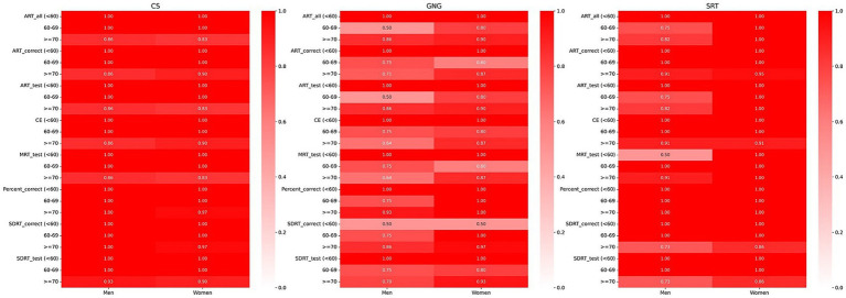
Figure 4.
Heatmap illustrating the percentage of BU ADRC participants who scored within the normal range on digital measures, segmented by sex and age and confined to the 2.5th to 97.5th percentile range. A deep red color signifies that 100% (a proportion of 1) of the participants in that particular demographic and digital measures are within the normal range, set between the 2.5th and 97.5th percentiles. Conversely, a white color denotes a 0% proportion, meaning that none of the participants in the group fell within the normal range for that specific digital measure. Shades of lighter red indicate proportions between 0 and 1, reflecting the varying percentages of participants within the normal range.

