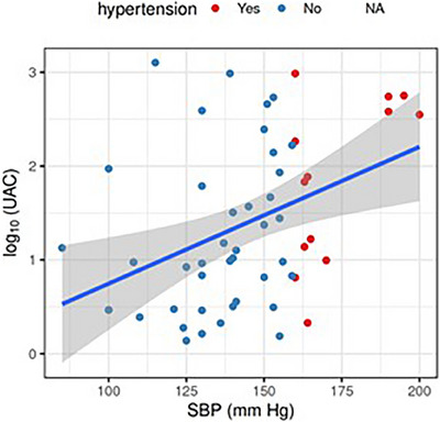
FIGURE 7.

The correlation plot shows the dependence of SBP and log(UAC). The data points are shown in blue (no hypertension) or red (hypertension), regression line is shown in blue, with the shaded area representing the corresponding confidence interval. In particular, the regression line has an intercept estimated as −0.7 (95% CI −2.1 to 0.7) and a slope as 0.015 (95% CI 0.005 to 0.024). This can be understood as a ten‐fold increase in UAC per every 67 mm Hg increase in SBP.
