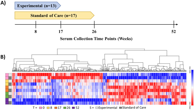
Fig 1. Overview of the serum proteome study.
(A) Timeline of the different patient population serum collection timepoints relative to treatment arm for a total of 30 patients. (B) Hierarchical clustering heatmap of the composite 676 proteins which exhibited differential abundance within the measured grouped timepoints, stratified by treatment type. Red to blue color gradient corresponds to higher to lower relative protein abundance values.

