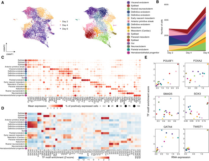
Figure 3.
Integration and cell type identification of the mESC data set by scTIE. (A) Joint visualization of the mESC data set using UMAP, colored by sampling day and cell type annotations. Each dot represents a cell in the embedding space. (B) Cell type compositions per time point. (C) Dot plots of mean expression of RNA data. Rows represent cell types, and columns indicate each gene. The color scale represents the expression level, and the size indicates proportion of positively expressed cells. The five most significantly expressed genes for each cluster are included. (D) Heatmap of the TF motif enrichment (Z-scores) of ATAC data. Rows represent cell types, and columns indicate TFs. The five most significantly enriched TFs for each cluster are included. (E) Scatter plots of the mean RNA expression levels by clusters (x-axis) and the average TF motif enrichment scores of ATAC (y-axis) for the selected TFs. The dots are colored by the cell type annotations, with the color legend consistent with that in A.

