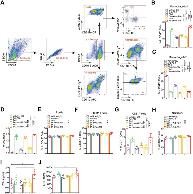
Fig. 4.
Changes in the proportion of immune cells analyzed by flow cytometry. A Representative flow cytometric images showed gating strategy and immune cell clustering. B Bar chart showed the proportion of M1 macrophages in CD45 + cells of each group. (labeled as ***, p < 0.001; ****, p < 0.0001). C Bar chart showed the cell proportion of M2 macrophages in CD45 + cells of each group(labeled as **, p < 0.01; ***, p < 0.001; ****, p < 0.0001). D Bar chart showed M1/M2 ratio in each group(labeled as *, p < 0.05; **, p < 0.01; ***, p < 0.001; ****, p < 0.0001). E–H Bar chart showed the cell proportion of T cells, CD4 + T cells, CD8 + T cells, and neutrophils in CD45 + cells (labeled as *, p < 0.05; ***, p < 0.001). I, J Bar chart showed the plasma concentration of IL-18 and IFN-γ in each group (*, p < 0.05)

